

Estación Display
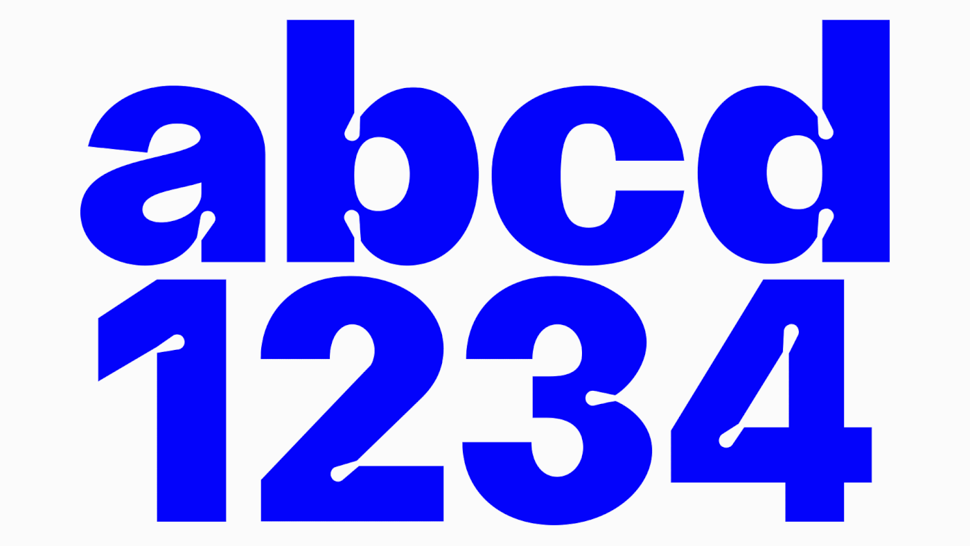
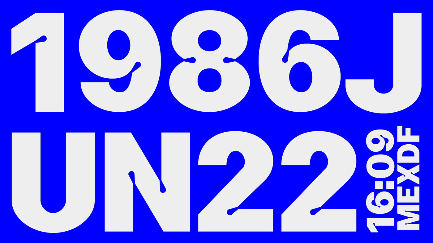
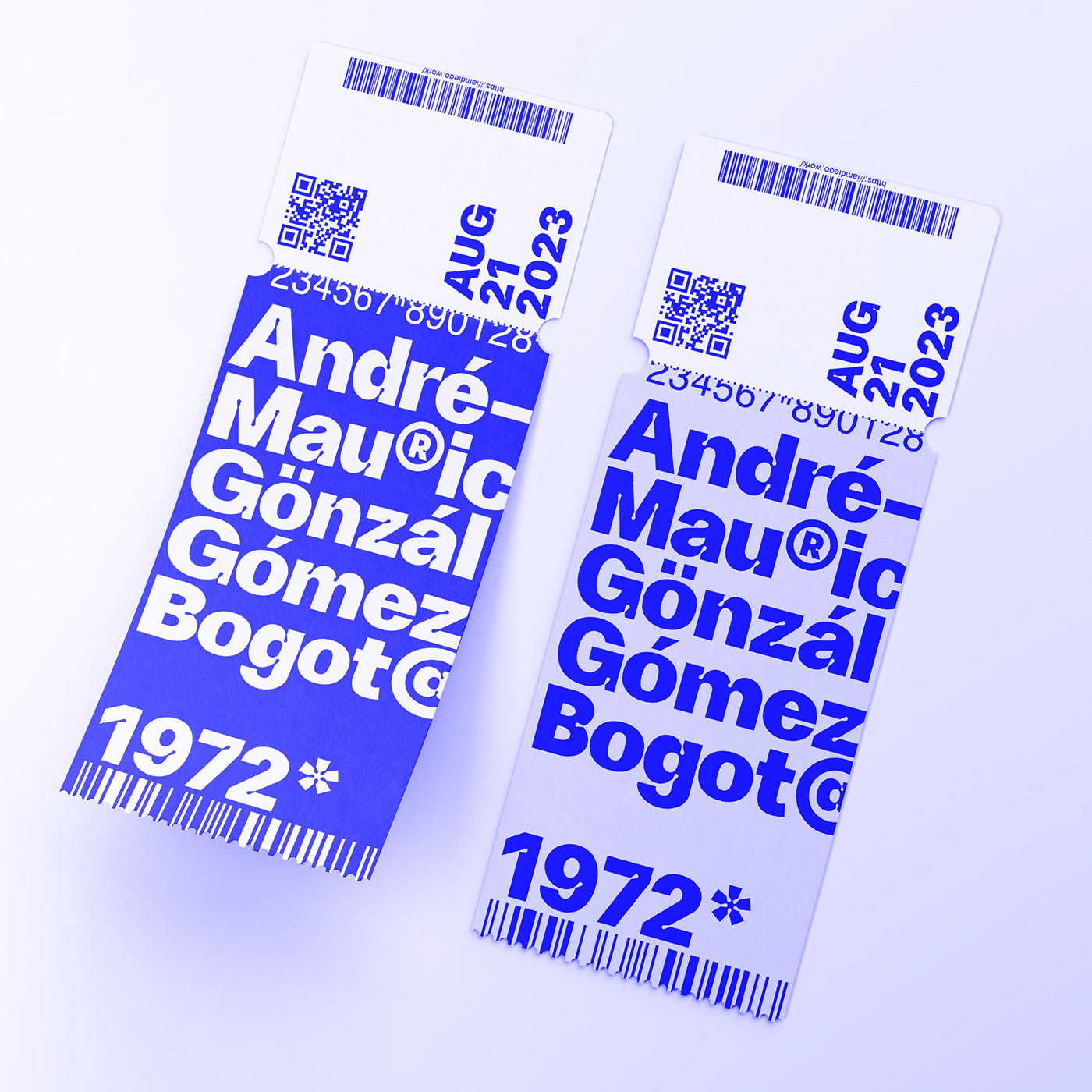
I like typefaces used in subway and commuter train stations. For instance, here in Madrid, Metro uses Helvetica. So, I decided to draw a new typeface based on those shapes but with a twist that made it unique. In this case, I played with ink traps (inspired by typefaces like GT Flexa, Whyte, Neue Machina, etc) to give it that particular character. Clearly, my intention here is not to create a new Helvetica or a new GT Flexa o something like that, I wouldn't know how to do it properly, I’m just in the process of learning how to draw typefaces and my goals are very modest. In this case, I wanted to draw a different font that maybe other people can use it in their projects as I learn new things about designing fonts. I think Estación Display is suitable for packaging and some big headlines. If you want to try it you can download it here.
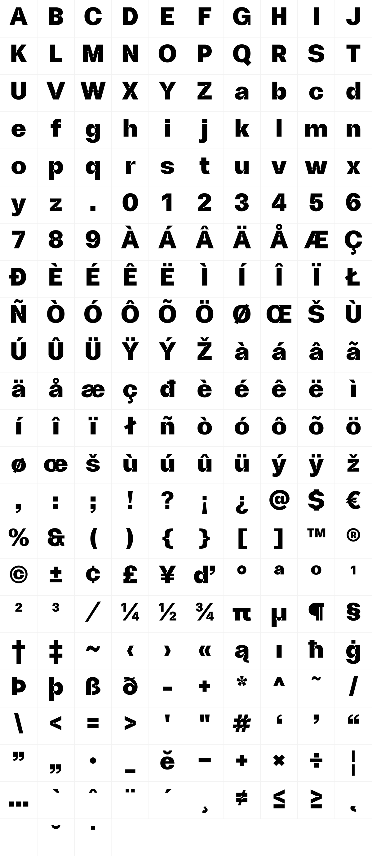
Languages Supported:
Afrikaans, Basque, Breton, Catalan, Danish, Dutch, English, Finnish, French, Gaelic (Irish, Scots), German, Icelandic, Indonesian, Irish, Italian, Norwegian, Portuguese, Sami (Southern), Spanish, Swahili, Swedish
Afrikaans, Basque, Breton, Catalan, Danish, Dutch, English, Finnish, French, Gaelic (Irish, Scots), German, Icelandic, Indonesian, Irish, Italian, Norwegian, Portuguese, Sami (Southern), Spanish, Swahili, Swedish


Credits.
For concepts I've used images by Greg Shield@unsplash, Miti@unsplash, Roland Lösslein@unsplash and NASA@unsplash.
If you want to try it you can download it here.


